Forecasting methods and formulas in Excel
This guide explains elementary forecasting methods that can be readily applied into Microsoft Excel spreadsheets. This guide applies to managers and executive who need to anticipate customer demand. The theory is illustrated with Microsoft Excel. Advanced notes are available for software developer who would like to reproduce the theory into a custom application.
Benefits of forecasting
Forecasting can help you make the right decisions, and earn/save money. Here is one example.
- Size your inventories optimally
Time is money. Room is money. So what you want to do is use all means at your disposal in order to reduce your stocks – without experiencing any shortages, of course.
How? By forecasting!
How to make things easy: labels, comments, filenames
Over time, as you data accumulate, you will be more and more likely to get confused; to make mistakes. The solution? Don’t be messy: making good use of labels, comments and naming your files correctly can save you a lot of trouble.
- Always label your columns. Use the first row of each column to describe the data it contains.
- Different data, different columns. Do not put different numbers (for example, you costs and your sales) on the same column. It is incredibly likely for you to get confused, and it makes computations and data handling more difficult.
- Give each file a clearly understandable name. It takes little effort and speed things up. It makes them easy to identify visually, and easier to find using the windows search function.
- Use Comments.
Even if you don’t usually work with a large amount of data, it is still very easy to get confused. This applies especially if you come back to the data you have created a long time before. Excel has a great solution to offer: comments.

The usefulness of comments
Just do a right click on the cell you want to comment, and then select « insert comment ».
You can use them:
- to explain the content of a cell (i.e. unit cost according to Mr Doe’s estimates)
- to leave warnings to future users of the sheet (i.e. I have a doubt about this calculation… )
Getting Started: a simple forecasting example using trendlines
Viewing your data
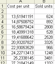
Let us now do our first forecast. In this part, we will be using this file: Example1.xls. To repeat the steps by yourself, you can download the file. This data serves just as example.
Our Data: In the first column, data about the unit costs of similar products (the unit cost reflects the quality of the product). In the second one, data about how much has been sold.
What we want to know: If we sell another product, with a quality corresponding to a cost of $150/unit, how many units can we expect to sell?
How we get there: Here, it is pretty simple. We want to find a simple mathematical relationship between unit cost and sales, and then use this relationship to do our forecast.
First, it is always useful to create a graph in Excel, in order to take a look at the data. Your eyes are excellent tools that can help you identifying trends in a few seconds.
To do this, we select our data, then use Insert > Chart, and chose the XY(Scatter) option. We want to estimate sales as a function of quality, therefore we put the unit cost on the horizontal and the sales on the vertical axes.
Now, we stop a few seconds and take a good look at what we see: the relationship seems to be increasing, and linear.
In order to get an idea of the exact form of the relationship, we right click on the chart, and select the “Trendline” option.

Creating a trendline
Now, we have to select the relationship that seems to “fit” (i.e. best describe) our data. Here again, we use our eyes: In this case, the dots are almost in a straight line, so we use the “linear” setting. Later on, we will use other - more complex, but often more realistic - settings, like “exponential”.
Our trendline is now displayed on the chart. Another right click allows us to display the exact form of the relationship: y = 102.4x - 191.64.
Understand: Number of unit sold = 102.4 times the unit cost - 191.64.
So, if we decide to produce at a $150 unit cost, we can expect to sell 102.4*150 - 191.64 = 15168 units

A linear trendline
We have just completed our first forecast successfully.
However, be careful: The software is always able to find a relationship between the two columns, even if this relationship is in reality very weak! Therefore a check for robustness is required. Here is how you quickly do this:
- First, always take a look at the chart. If you find the dots closely located to the trendline, as is the case in our example above, there is a good chance that the relationship is robust. However, if the dots seem to be located almost randomly and are in general quite far from the trendline, then you should be careful: the correlation is weak, and the estimated relationship should not be blindly trusted.

The dots are everywhere: no evident relationship, unreliable forecasts
The dots “make sense”, and allow more reliable forcasting
- After taking a look at the chart, you can use the CORREL function. In our example, the function would read: CORREL(A2:A83,B2:B83). If the result is close to 0, then the correlation is low, and the conclusion is: there is simply no real trend. If it is close to 1, then the correlation is strong. The latter is a helpful, since it increases the explanatory power of the relationship you found.
There are more subtle ways of making sure the correlation is high; we will come back to this later on.
Of course, these last steps can be automated: you don’t have to note the relationship, and use your pocket calculator to do the computation. You need the Analysis Toolpak!
Forecasting using the Analysis Toolpak
Before proceeding, you should check if the Excel ATP (Analysis Toolpak) is installed. Refer to the section Installing the Analysis Toolpak, for further information.
Unfortuntaley such perfect sales data with such a nice, simple linear relationship is quite uncommon in real life. Let us have a look at what Excel has to offer for more complicated situations, with more complicated data.
Going further: the example of exponential fitting
As you might imagine, such a linear model of your data is not always likely. In fact, there are many reasons to believe that it should follow an exponential model. Many behaviors in the economy are driven by exponential equations (i.e. interest compounding computations are a classical example).
Here is how to perform an exponential fitting:
- Take look at your data. Draw a simple graph, and just look at it. If they follow an exponential evolution, they should look like this:

perfect exponential shape
This is the perfect case. Of course, the data will never exactly look like this. But if the dots seem to approximately follow this repartition, it should encourage you to consider exponential fitting.
Using trendlines
As in the previous example, you can always draw a chart of your data, ask for a trendline, and choose « exponential » instead of linear. Then, gather the displayed equation, as usual.
- Luckily, you can also do all this directly, using the Analysis Toolpak: Put all your data into a blank excel sheet, and go to Tools => Data Analysis
Installing the Analysis Toolpak (ATP)
The ATP is an add-in that comes with Microsoft Excel, but that is not always installed by default. In order to install it, one can proceed as follows:
- Make sure you have your Office CD with you. Excel might require you to insert the CD in order to install the ATP files
- Open an excel sheet, and go to Tools Menu, and then select Add-Ins. Check the first box of the window, labeled « 2.Analysis Toolpak ».
- Insert your Office CD if asked to do so by the software.
- That’s it! Notice that your « Tools » menu now includes many more features, including a « Data Analysis » option. This is the one that we will use the most.
Using the Analysis Toolpak (ATP)
… in a linear setting
Now, let us come back to our linear example. If your data « looks » good (see above illustration), you can use the ATP to get a direct estimation of the functional form, without going through the « trendline »process.
Open your data sheet, then open the « tools » menu and select « Data Analysis ». A window pops up, asking you what kind of analysis you want to perform. Select « regression » for linear settings.
Now you need to give Excel two arguments: an « Y range » and an « X range ». The Y range indicates what you want to estimate (i.e. your sales), and the X range contains the data that you think can explain your sales (here, your unit cost). In our example (see example1.xls), our sales data are in column B, from row 3 to row 90, so you need to put « $B$3:$B$90 » as the Y range, and «$A$3:$A$90 » as the X range. When you are done, click « ok ».
A new sheet appears, containing the « regression results ».

The Analysis Toolpak Output, in the case of an Ordinary Least Squares regression
The most important result is contained in the « Coefficients » column at the bottom of the sheet. The intercept is the constant, and the « X variable » coefficient is the coefficient of X (here, your unit cost). Hence, we find the same equation we found using the « trendline » function. Sales = Intercept + Xcoefficient * unit costSales = -126 + 100 * unit cost
This sheet also contains a useful number that gives you information about how good your estimation is: the « R Square ». If it is close to 1, then your estimate is good, which means that the equation you found is a fairly good representation of your data. If it is close to 0, then the estimation is not good, and you should probably try another kind of fitting (see exponential fitting below).
This method is probably faster than the « trendline » techniques. However, it is a bit more technical and much less visual. So if you do not want to go through the trouble of plotting and eyeballing your data, make sure you at least check the « R square » value.
… using exponential fitting
If the linear estimation does not go well (for instance if you obtain a low R-Squared, i.e. 0.1), you may want to use Exponential Fitting.
Launch the Analysis Toolpak, as usual: Open your data sheet, then open the « tools » menu and select « Data Analysis ». A window pops up, asking what kind of analysis you want to perform.
In our exponential setting, what we want to select is « exponential ».
Notice that Excel only asks you for one input range. Select the column that contains the data you want to forecast (i.e. unit cost), and pick a “smoothing factor”.
How do I know what model to choose?
Note that you do not need to try each estimation method in order to find the one that works best for you. This can only be achieved through automation, since there is such a large number of methods available. If you want all models to be benchmarked against your data, you can consider sending them to Lokad. We have a powerful computer system that “tests” all models and selects only the ones that work best with the data of your business.