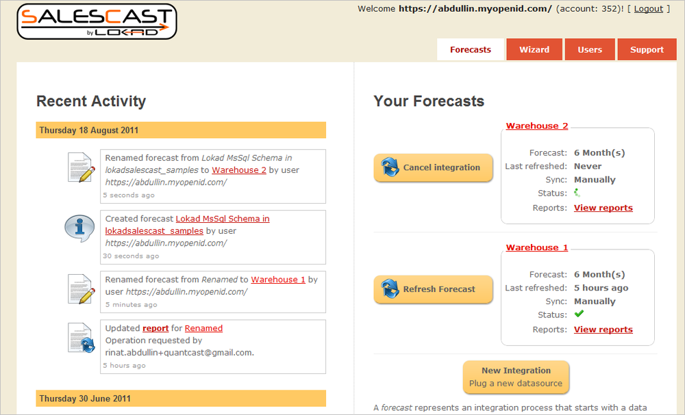
Our flagship inventory optimization product, Salescast, has benefited from a major documentation refresh about 3 months ago. Now it’s the turn of the user interface (UI) to be extensively redesigned. Here below is a screenshot illustrating the new look & feel (deployed today).
The previous UI was suffering from several problems:
not following UI standards, making it harder for everyone to figure out how Salescast was working. In this version, we have paid a lot more attention to make Salescast not only simpler, but closer to the de facto standards (Amazon, Facebook for example). People should not have to think about UI.
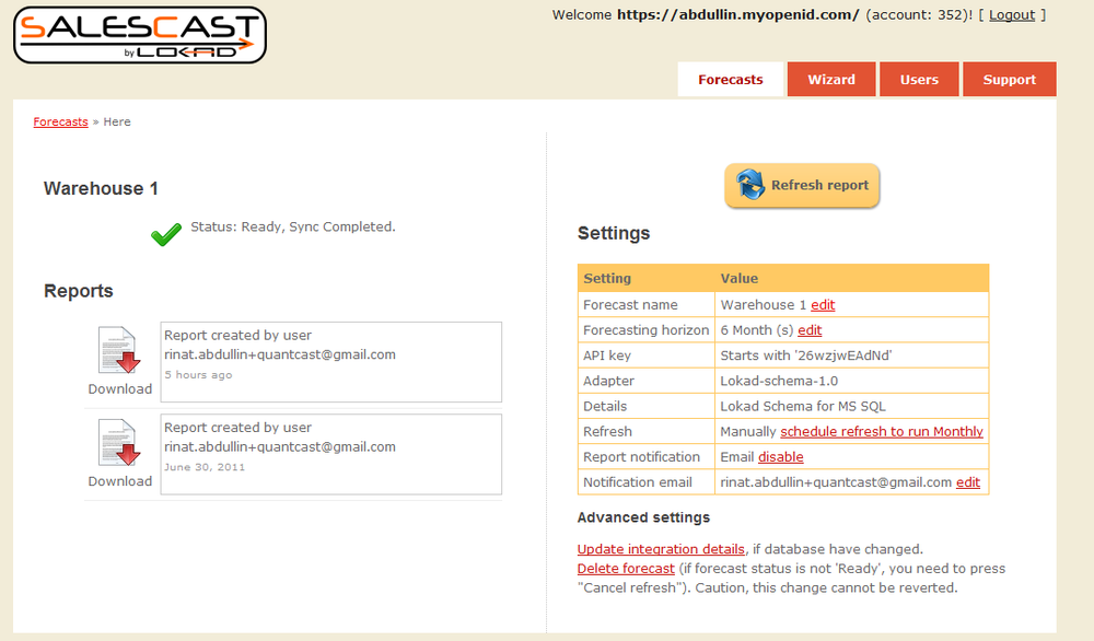
not focusing on changes, complicating the team usage of Salescast. In this version, the most notable UI addition is the Recent Activity listing that tells who has been doing what. Recent activity is a killer feature for teamwork. A lot of teamwork confusion happen job just because Bob did not tell Alice, he had just generated a new report. Now Alice will immediately notice what Bob has done, by simply looking at the recent activity.
confusion between queries and commands, triggering the generation of new reports (and causing extra charges!) while the intent was only to browse existing reports. Now, the commands are put on the right while the queries (read only) are gathered on the left. By establishing this simple distinction, we hope to siginificantly reduce the number of misclicks.
Since it’s initial release 15 months ago, Salescast has steadily improved, and this release is certainly not our final word. More good stuff is coming. Stay tuned.
Side note: a new logo for Salescast is also under way :-)